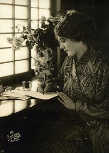
Mary Pickford’s many friends were often the recipients of notes: her thank you’s, sympathy cards, apologies and general news were almost always written on distinctive note cards, outlined in teal blue and then signed with the same color ink. Her signature was unique as well, with the big loop on the M and the smaller loop at the top of the P. Whether you were a friend or a fan requesting an autographed picture, you knew it was her signature at a glance.
 And she was proud of her signature. She had been perfecting it since shortly after she became Mary Pickford, changing her name as a teenager from Gladys Smith at the urging of New York theatrical impresario David Belasco.
Of course, Mary signed more than notes, letters and photographs. She also signed contracts – million-dollar contracts – and by the time her signature reached the bottom of the page, many a mogul had been challenged as never before.
Mary might have called Adolph Zukor “Papa,” but that didn’t mean that she was a pushover in negotiations with him. When she, with her mother Charlotte at her side, agreed to a new contract in July of 1916 that was to garner her $10,000 a week, a $40,000 signing bonus and a percentage of the profits, Zukor told her, “Mary, sweetheart, I don’t have to diet. Every time I talk over a new contract with you and your mother, I lose ten pounds.”
There would be many more contracts after that, including the one that created United Artists, and her signature would also appear on many charitable donations and as one of the founders of the Academy of Motion Picture Arts and Sciences. And so because of the historic significance that Mary Pickford’s signature represents, we at the Mary Pickford Foundation are proud and pleased to use her signature in our logo.